What’s black and white and red all over? No, not a newspaper. We’re talking about SUPERSTRUCTURES’ logo. We felt it was time to reflect on what this brand symbol stands for.
In 1985—soon after SUPERSTRUCTURES’ founding (but before we became the most prolific exterior restoration firm in the city)—our logo was designed by Joe Roberts, Chair of Graphic Design at the Pratt Institute. It was inspired by the bold geometry and primary colors of Constructivism. It’s also an early example of a square logo, later adopted by so many A/E firms and other companies like AmEx. A square fits well in the title block of our drawings and stands out in signage on sidewalk sheds. We also think this perfect Platonic shape suggests the seriousness and precision of our practice.
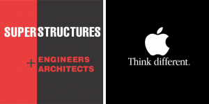
Turning to another well-established brand, Apple’s universally recognized logo suggests how they’ve taken a bite out of their industry, or, as Steve Jobs put it, “put a dent in the universe.” We’ve done the same in our specific realm of restoring New York’s buildings, making an impact on the fundamental fabric of the city. We also take inspiration from Apple’s famous tagline “think different,” following that maxim in continually driving the practice of exterior restoration forward by questioning conventional thinking.
We’ll continue this conversation in future posts by considering other iconic company logos.
14 Wall Street, 25th Floor, New York, NY 10005
(212) 505 1133
info@superstructures.com
Subscribe to SuperScript, our email newsletter.
